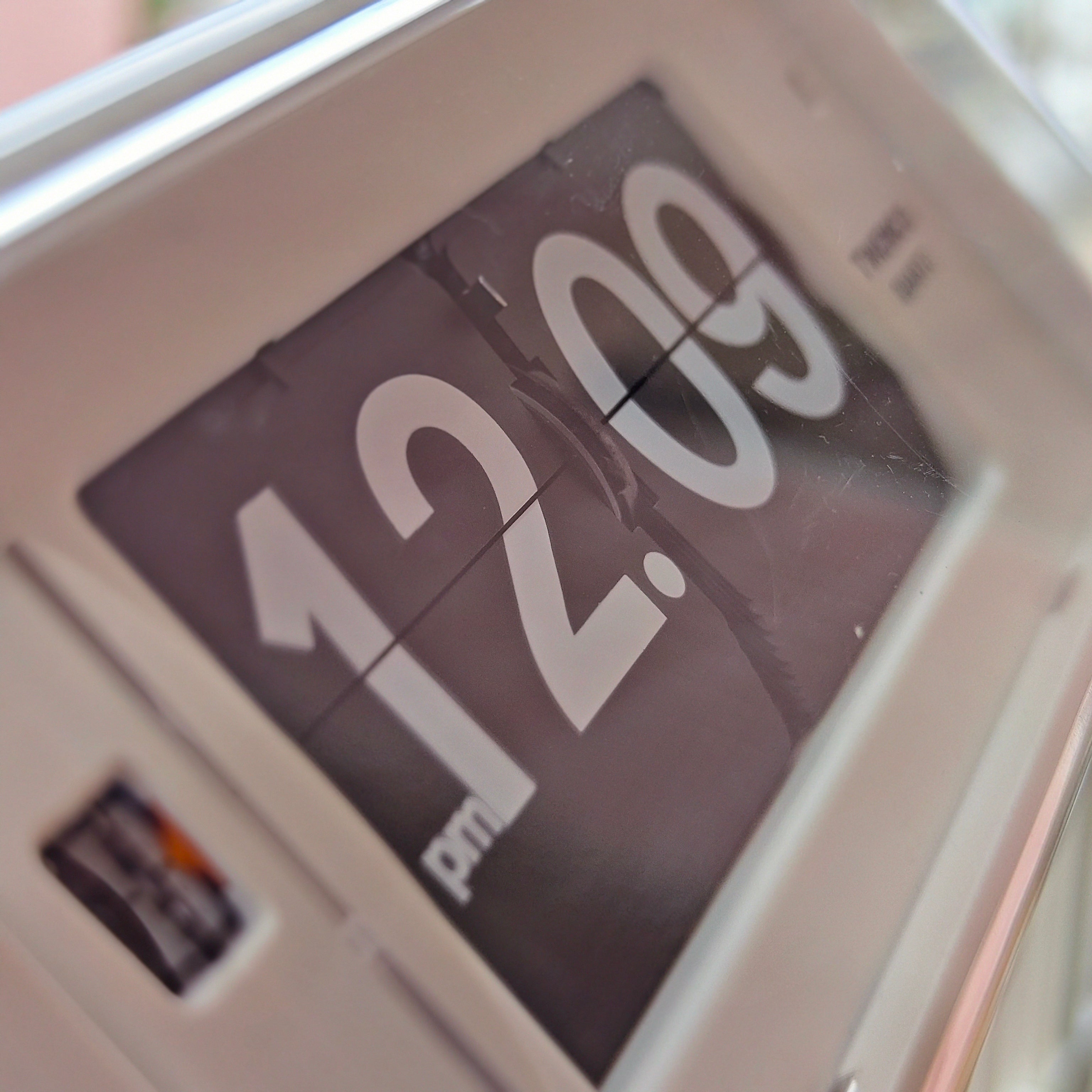
A flip clock can sit comfortably in a modern interior. Its strong numerals and moving display bring a little character to a room built around clean lines, calm colours and useful objects. The trick is to give it a clear role. Treat it as a deliberate focal point or a small accent, then leave enough space around it to feel considered.
You do not need to turn the room into a retro set. A single flip clock can work with contemporary furniture when its scale, materials and placement relate to the rest of the space.
Decide what the clock should do in the room
Before choosing a shelf or wall, decide whether the clock should lead the composition or support it. A larger, high-contrast model naturally draws the eye. A compact tabletop clock can sit among books, ceramics or a lamp without taking over. Both approaches work; problems tend to appear when the clock is treated as an afterthought and squeezed into whatever space remains.
If the clock is the focal point, give it a quieter background. A plain section of wall, a clear console or a simple shelf lets the display read at a glance. If it is an accent, repeat one detail elsewhere in the room, such as a dark finish, warm wood or a touch of orange. This small connection makes the object feel chosen rather than dropped in.
For a broader look at calm forms and restrained details, see our guide to minimalist clock design.
Match the scale to the viewing distance
A clock that looks balanced in a product photo can feel too dominant on a narrow shelf or too small across a living room. Measure the available width and height, then mark the clock’s outline with paper or masking tape. Look at that shape from the doorway and from the place where you will normally read the time. This quick test helps you judge visual weight before rearranging furniture.
On a wall, align the clock with a piece of furniture or another strong line in the room. Above a console, for example, the clock can sit in the same visual column as the table rather than drifting toward one side. Leave breathing room around the case, especially if it has a bold frame or an exposed mechanism. Our living-room guide to statement wall clocks covers focal points and proportion in more detail.
For a tabletop clock, think about the depth of the surface as well as its width. Keep the display visible from the seat or work position, and avoid hiding it behind a tall plant, monitor or stack of books. A clock should contribute to the arrangement while remaining easy to use.
Use negative space to make the display feel intentional
Flip clocks already contain movement and strong graphic shapes. They rarely need a crowd of accessories around them. Start with the clock alone, then add only what helps the composition: perhaps a short stack of books, a small plant or one sculptural object. Leave an open area beside or above the clock so its silhouette stays clear.
On a bookshelf, avoid lining every item up at the same height. A low horizontal stack can balance the clock, while a taller object placed farther away adds a different scale. Keep the numbers unobstructed and make sure the clock is stable on the surface. On a desk, reserve a useful spot where you can glance at the time without moving other things each day. For a more layered workspace example, see our retro-tech desk styling guide.
Choose materials that connect with the room
Look for one or two material relationships rather than trying to match every finish. A bamboo frame can echo a timber shelf or soften a room with metal and glass. A visible mechanism can add detail to a room with smooth surfaces. A dark case can repeat the line of a lamp, picture frame or chair base.
The Crystal Nord Bamboo Flip Clock brings natural grain to the display, so it can sit alongside wood without needing a full vintage palette. The MIDCLOCK Home Decor Flip Clock has an open mechanism that makes the clock itself a more graphic object. Use a more expressive design where it can be seen; if the room already has several focal points, choose a simpler silhouette.
Colour works in much the same way. Pick up one colour already present in the room, or use the clock as a controlled contrast against a neutral wall. You do not have to match the clock exactly to a cushion or artwork. A repeated accent is enough to make the palette feel connected.
Place it where the room’s routine makes sense
Living room
A sideboard, console or open shelf gives a tabletop flip clock a stable, visible place. If you want it on the wall, choose a model designed for wall display and check its instructions before mounting. Keep the clock in a spot that can be read from the seating area, then let nearby frames and objects support it without competing for attention. The NeXtime Modern Flip clock is listed for table or wall placement, which makes it one option when you are deciding between those two roles.
Desk or study
Place the clock where it can be read with a brief glance, not directly in the middle of the work area. A compact model can balance a monitor or lamp, while an open shelf above the desk can keep the surface clear. If the clock’s minute change is audible, try the position during a normal work session before making it part of a bedroom or quiet workspace.
Bedroom or reading corner
Choose a display that is easy to read from the bed or chair and keep it away from objects that might cover the cards. If you are sensitive to sound, listen to the clock in the room before settling on its permanent position. A small side table or a shelf within view can be more comfortable than placing it close to your head.
A simple styling test before you finish
Clear the surface or wall area and place the clock first.
Step back to the doorway and check whether its size feels right.
Add one or two supporting objects, using a material or colour already in the room.
Look at the arrangement from the usual viewing position and check that the display is unobstructed.
Remove anything that makes the area feel crowded or pulls attention away from the clock.
This is a practical way to style a flip clock without overthinking it. If you want to compare different shapes and finishes, browse our flip clock collection, explore minimalist clocks, or see the wider range of table clocks.
Common styling mistakes to avoid
Filling every gap. Empty space is part of the arrangement; do not add accessories simply because a shelf looks bare.
Ignoring the room’s scale. Test the clock’s outline before choosing a wall or surface.
Mixing too many strong accents. A vivid clock can be the main colour statement; give other objects a quieter role.
Choosing a spot for appearance alone. Check that the display can be read and the clock can be used comfortably.
Forcing a full retro theme. One tactile object can add contrast to a modern room; the furniture and accessories do not all need to match its era.
Frequently Asked Questions
Can a flip clock work in a minimalist interior?
Yes. Keep the surrounding area simple and let the clock provide one point of contrast. A clean case or a natural material can sit easily among restrained furniture and finishes.
Where should I place a flip clock in a living room?
Choose a stable surface or a suitable wall position where the display is visible from the seating area. Check the model’s intended placement and leave enough room around it to keep the silhouette clear.
How do I style a flip clock on a bookshelf?
Place it where the numbers remain visible, then balance it with a low stack of books or one smaller object. Keep some open shelf space around the clock so it does not disappear among the other items.
Should a flip clock match my furniture?
It does not need to match exactly. Repeating one colour or material nearby is usually enough to make the clock feel connected to the room while preserving its own character.